Reporting Overview
BusGenius offers comprehensive reporting tools designed to provide detailed insights into transit operations, many of which are developed in close collaboration with our clients. We meet regularly with our clients to learn from their expertise and understand their unique needs, allowing us to tailor reports highlighting key performance metrics such as vehicle utilization, on-time performance, and headways.
BusGenius makes identifying trends, uncovering inefficiencies, and making data-driven decisions easy. By leveraging real-time CAD/AVL/APC data, we ensure that our clients can access the information they need to improve service reliability, reduce costs, and enhance the overall rider experience. Our reporting empowers transit professionals to stay informed and proactive in managing their fleets.
The following pages include a sample of our reports, with descriptions of each.
Passenger Counting
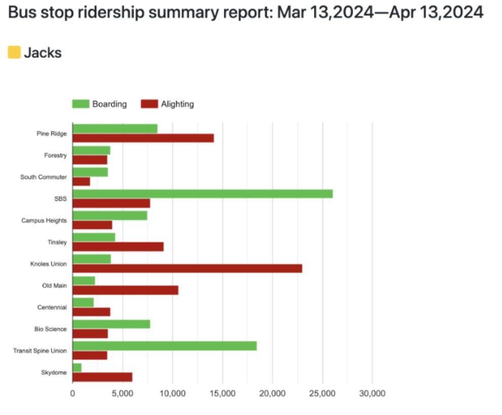
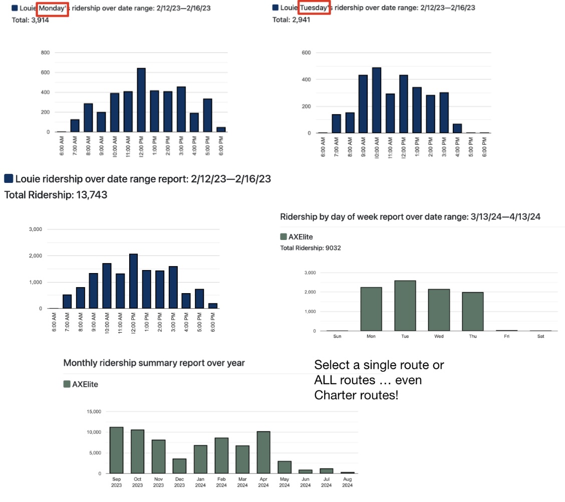
Passenger counting with BusGenius not only provides real-time ridership data but also delivers valuable reports that offer deeper insights into ridership patterns and behaviors. Our system generates detailed reports on your passenger counts, including counts by day of the week, month, and hour, parameterized by route and date ranges, giving transit agencies a clear understanding of ridership trends over time. Additionally, we provide load reports that show vehicle occupancy levels throughout the day, helping operators identify peak travel times and adjust services accordingly. These reports empower transit managers to make data-driven decisions, optimizing schedules, routes, and resource allocation to enhance overall efficiency and service quality.
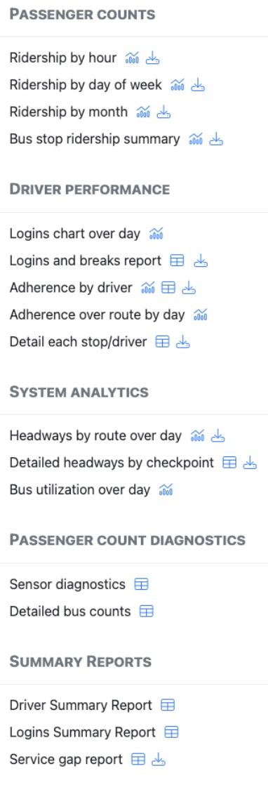
The BusGenius platform offers powerful ridership analytics to help transit agencies make data-driven decisions. With options to view Ridership by Hour, Ridership by Day of Week, Ridership by Month, Ridership by Year and a comprehensive Bus Stop Ridership Summary, agencies can easily identify patterns and optimize routes based on real-world data. These reports provide clear insights into peak hours, popular days, and monthly trends, allowing for more efficient resource allocation and improved service planning. By understanding rider behavior, agencies can increase operational efficiency and deliver a better rider experience.
APC Accuracy and Reliability
BusGenius prides itself on producing accurate and reliable passenger counts. To achieve this, we’ve built a suite of diagnostic reports and real-time alerts that identify any malfunctioning or miscalibrated hardware so we can quickly address issues. For transparency purposes, we also share these reports and alerts with our customers in the BusGenius admin portal so you can verify the performance of your APC hardware yourself.
Sensor Diagnostic Report
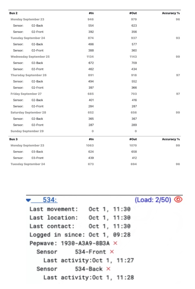
We track the in and out counts produced by the sensor(s) in your vehicles, and derive an accuracy score for each vehicle based on how close the ins match the outs. If accuracy is low, we know there is an issue with sensor calibration – we can remotely access the sensors we install, to recalibrate them without needing to come back onsite.
Real-time APC hardware alerts
The red eye icon indicates the APC system is currently experiencing a hardware issue in vehicle 534. The red X icons indicate the different APC hardware components that are unexpectedly not receiving power.
Service Gap
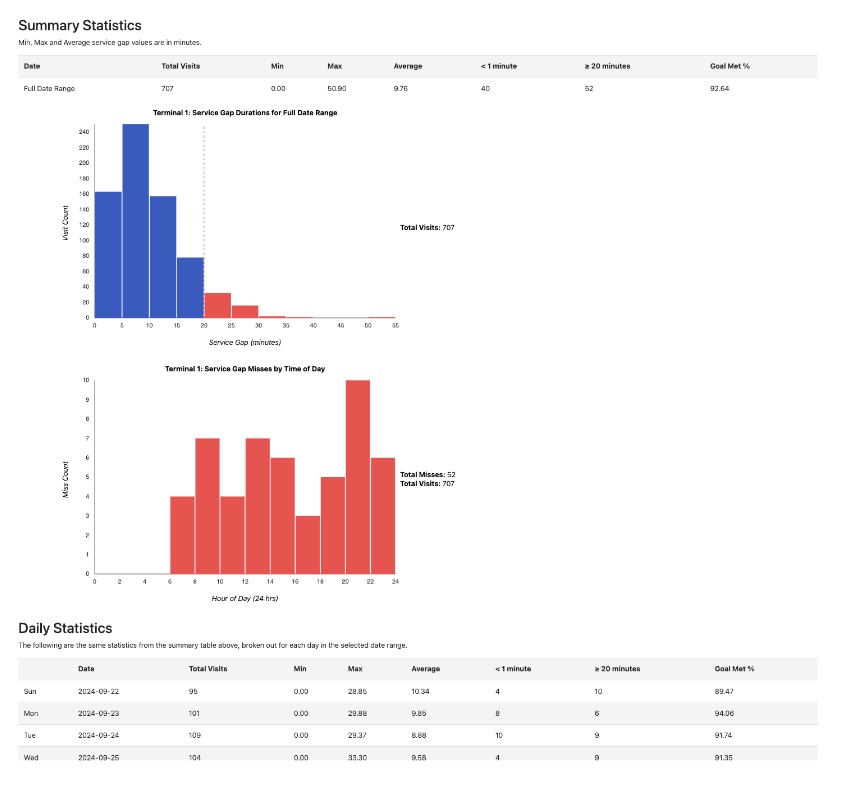
We enjoy working closely with our customers and getting feedback on what kind of reporting they would find useful. One such example of a customer feedback-based report that we’ve implemented is our Service Gap Report: this report measures how often you were able to achieve a given service goal at a stop along your route (e.g. 15 minute service to Terminal 1). This is useful for customers who maintain frequency-based schedules to see if you’re actually achieving the level of service you’re setting out to deliver.
- Use histograms to visually identify your most frequent level of service over the reporting period. Identify if you’re overserving your ridership based on your goals.
- Use the “Misses by Time of Day” graph to see when you’re most often struggling to achieve your service goal, which could highlight driver scheduling issues.
- Dig in to statistics and data for individual days of the week to identify if certain days have consistently better service than others.
Missed Stop
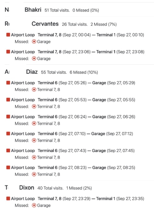
BusGenius knows the expected sequence of stops in your fixed route, and can therefore identify when stops were missed during service.
Use the missed stop report to identify specific instances (with timestamps) of drivers who missed stops, so you can hold drivers accountable and coach them towards better performance.
Driver Performance
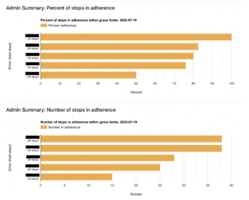
The BusGenius Driver Performance reports offer clear, visual insights into how well drivers adhere to the instructions sent to them in the Driver App. The reports track the percentage of stops in adherence, showing the proportion of stops made within allowable grace periods, and the number of stops in adherence, breaking down the total number of compliant stops for each driver. The easy-to-read charts allow transit managers to quickly assess driver performance and identify areas for improvement. By comparing drivers and hovering over the bar graph, agencies can pinpoint drivers that affect service reliability and make informed operational decisions to ensure adherence across the board.
Headway Performance Over Day
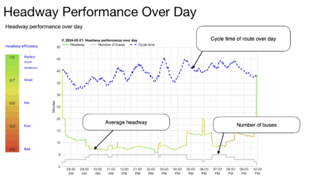
The Headway performance over day report provides a comprehensive view of route efficiency. It tracks average headway (time between buses), number of buses on the route, and cycle time (time to complete one entire loop). By color coding headway to correspond to efficiency, green being perfect and red being poor, transit managers can quickly assess how efficiently their shuttles are running and see that BusGenius is working to remove bunching proactively. This report is an essential tool that transit managers can use to look for ways to optimize performance and ensure a consistent experience for riders.
Bus Trail
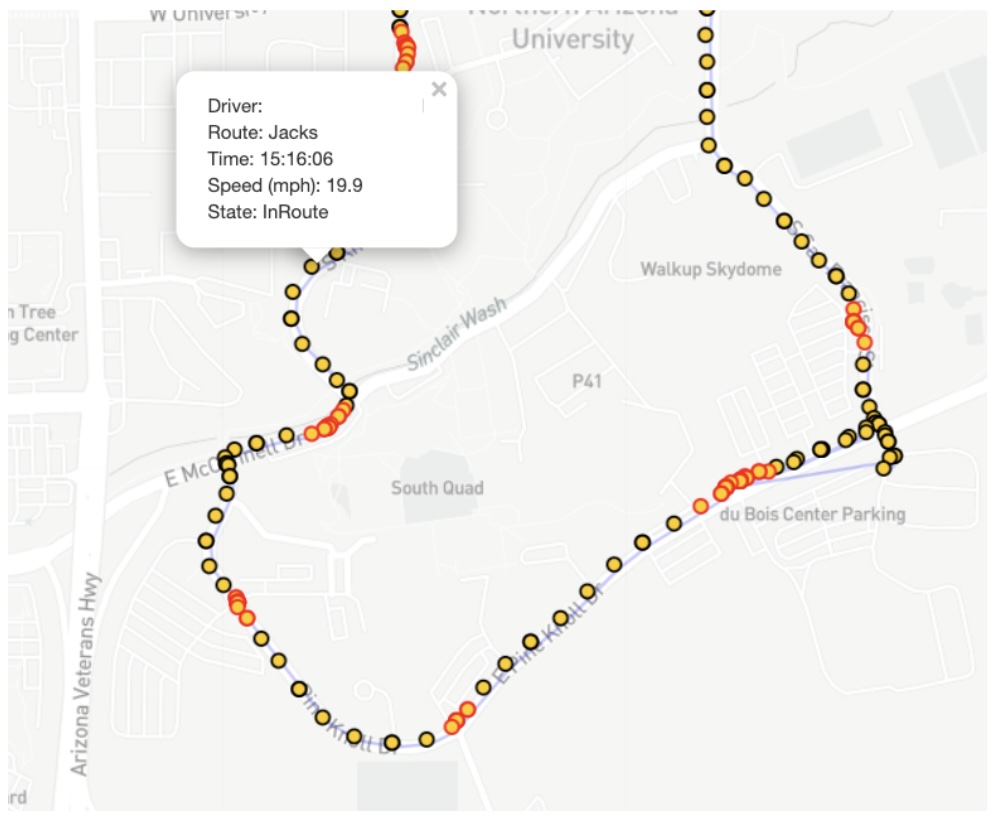
The Bus Trail report provides a detailed visual record of each vehicle’s movement along its route. The map displays critical data, such as driver name, route, and speed, with precise timestamps. This gives transit managers historical records of their fleet's movements. This tool is useful for tracking bus driver performance and ensuring they are following the route, have stayed within a safe driving speed, and can provide records if an incident or rider complaint occurs.
Bus Load
Heatmap
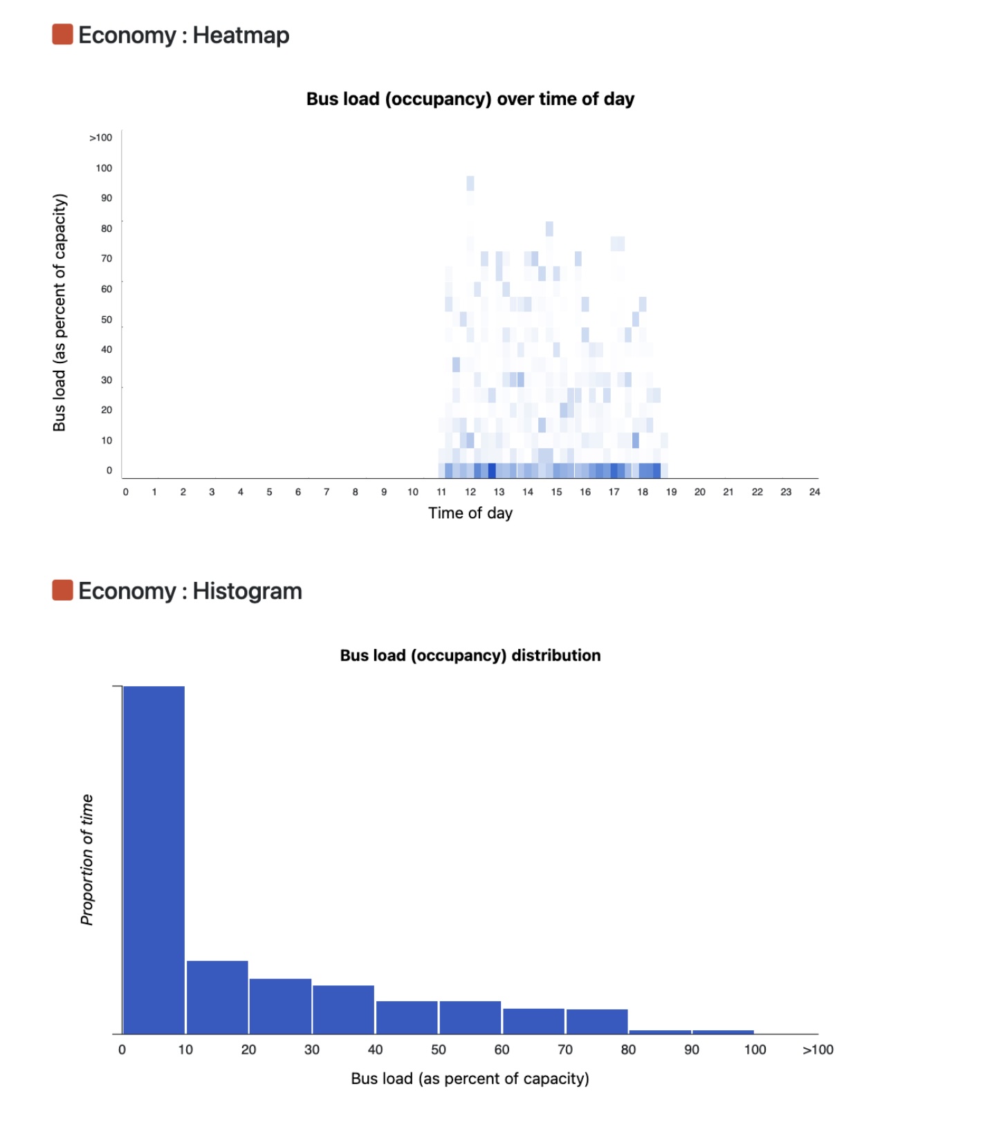
The heatmap shows the relative bus loads (occupancy) over the day for the date range selected for all buses on the route. Dark regions indicate that more buses within a time period (horizontal axis) have the load indicated on the vertical axis, whereas lighter regions indicate fewer buses with the indicated load.
For example, a darker region that is positioned low on the vertical axis indicates many buses of low occupancy at the indicated time period; whereas, a darker region positioned high on the vertical axis indicates many buses of high occupancy at the indicated time period.
And for example, a lighter region that is positioned low on the vertical axis indicates few buses of low occupancy at the indicated time period; whereas, a lighter region positioned high on the vertical axis indicates few buses of high occupancy at the indicated time period.
This information is useful for optimizing fleet efficiency, and ensuring proper vehicle allocation to meet demand.
Histogram
The histogram shows the relative bus-hours spent at given loads (occupancy) for the date range selected.
For example, a tall bar indicates many bus-hours spent with load indicated by the horizontal axis. A short bar indicates relatively few bus-hours spent at the load indicated.
Hover over a bar to get the exact proportion of bus-hours spent for a given load.